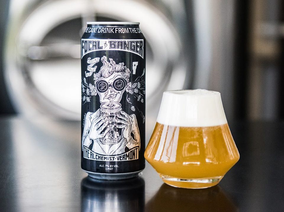
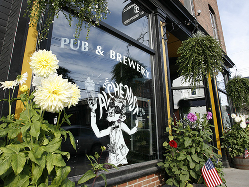
Alchemist Brewery Rebrand
The Alchemist Brewery provides New Englanders with sustainably made premium IPAs, employing artistic and unconventional ideas and flavors all while giving back to their community. The Alchemist as a brand is at a turning point, where they desire more consistency within their branding to create a unified look and feel for better brand recognition.
I used the phrase, exemplar craft with a hint of magic, to guide my research and design. I choose a modernized black letter logo font to illustrate exemplar craft while using the “sparkle” icon and cheeky pen and ink illustrations to represent the hint of magic/fun.


The chosen style-guide.