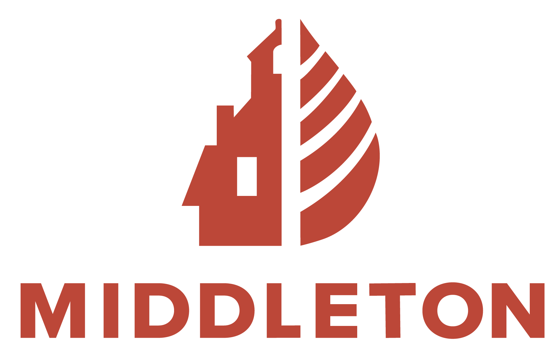
For the Hometown Rebrand project, I rebranded Middleton Massachusetts’s brand identity, my hometown. Middleton is a small farm suburban town, a perfect distance between the city, mountains, and the ocean, hence the name Middleton. The town is also rooted in academics, with most new residents coming for the school district. So I knew I wanted to modernize the identity while keeping true to the town’s historic and scholastic background. The typeface Niveau Grotesk is influenced by classical nineteenth-century faces. Because of its straight architecture, it punches in big sizes but is also legible in smaller sizes. For the logo, I choose to combine a leaf, representing nature, and iconic silhouetted buildings from Middleton. I enjoyed working on this project not only because it was my first branding project and lead me to fall in love with the medium but because it is also a subject matter that is close to my heart.
Logo exploration and ideation.
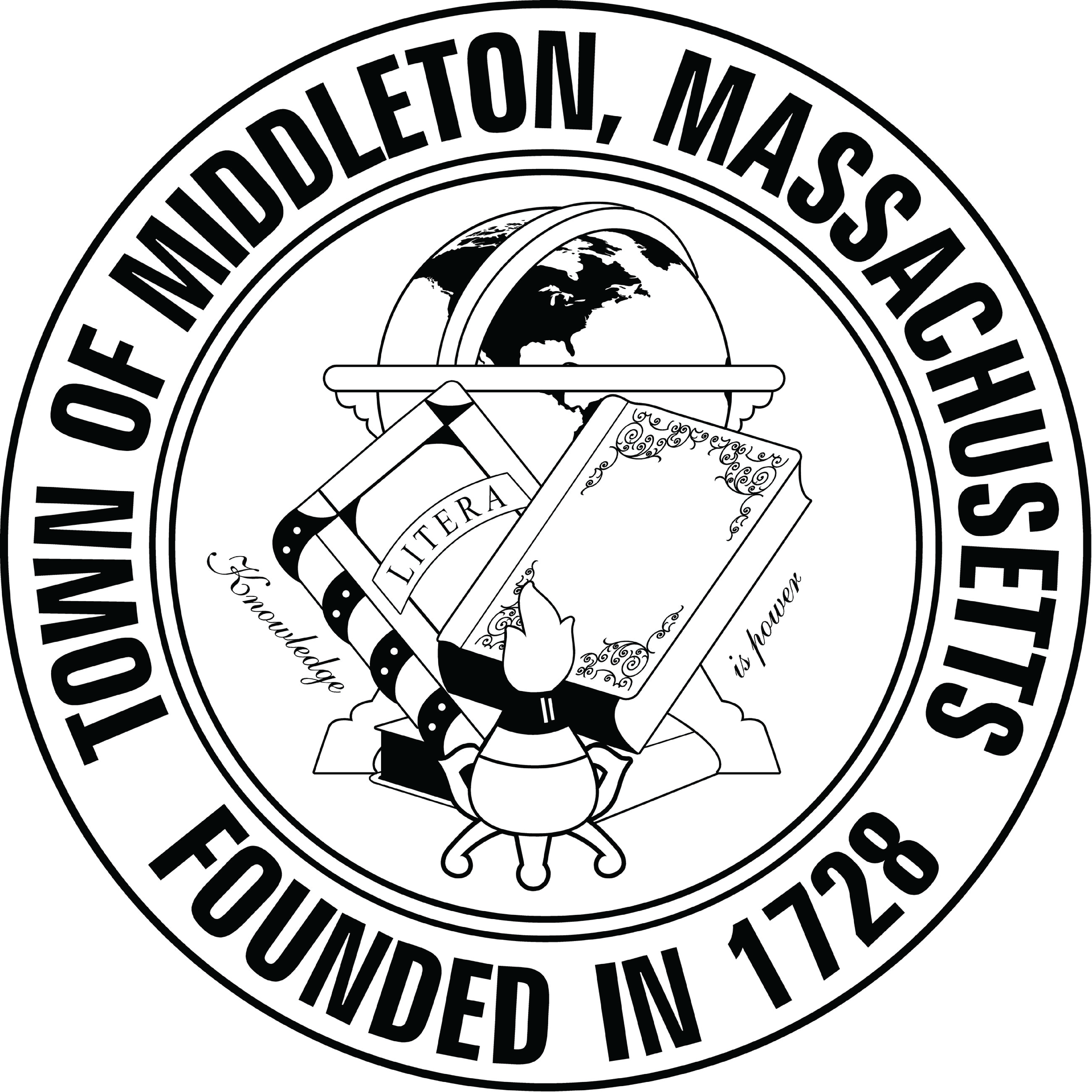
Original Logo
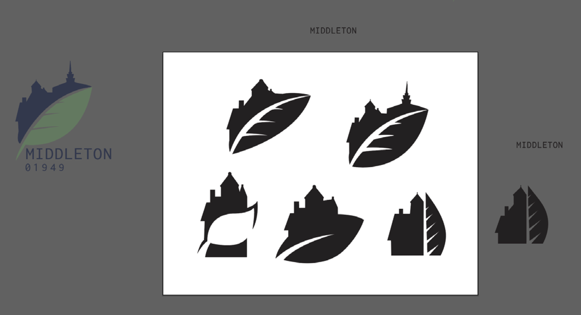
Refined logos
