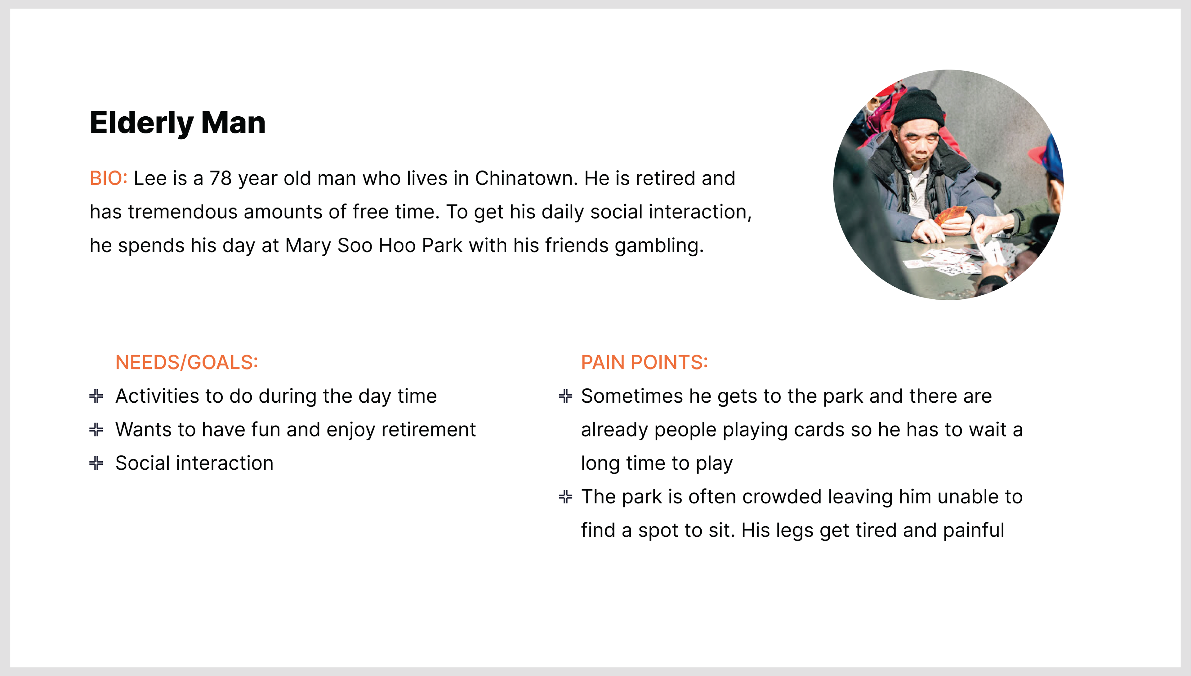
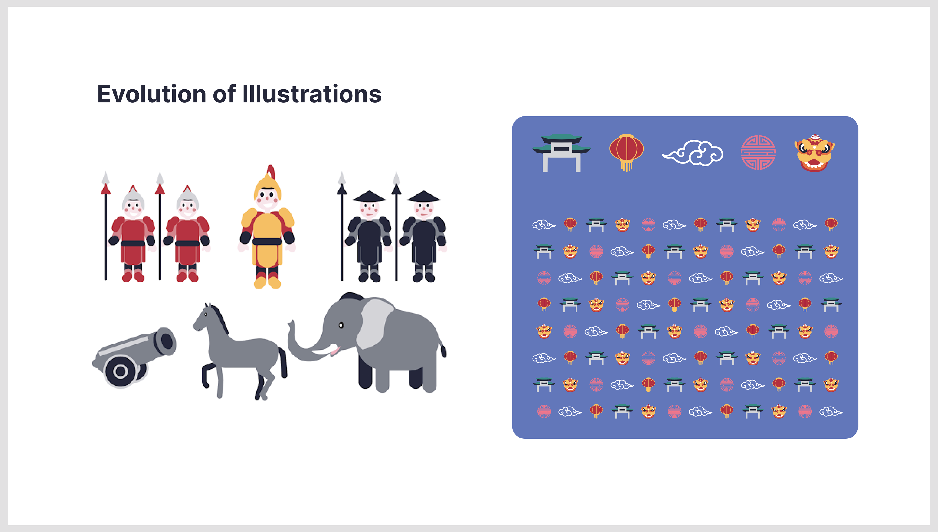
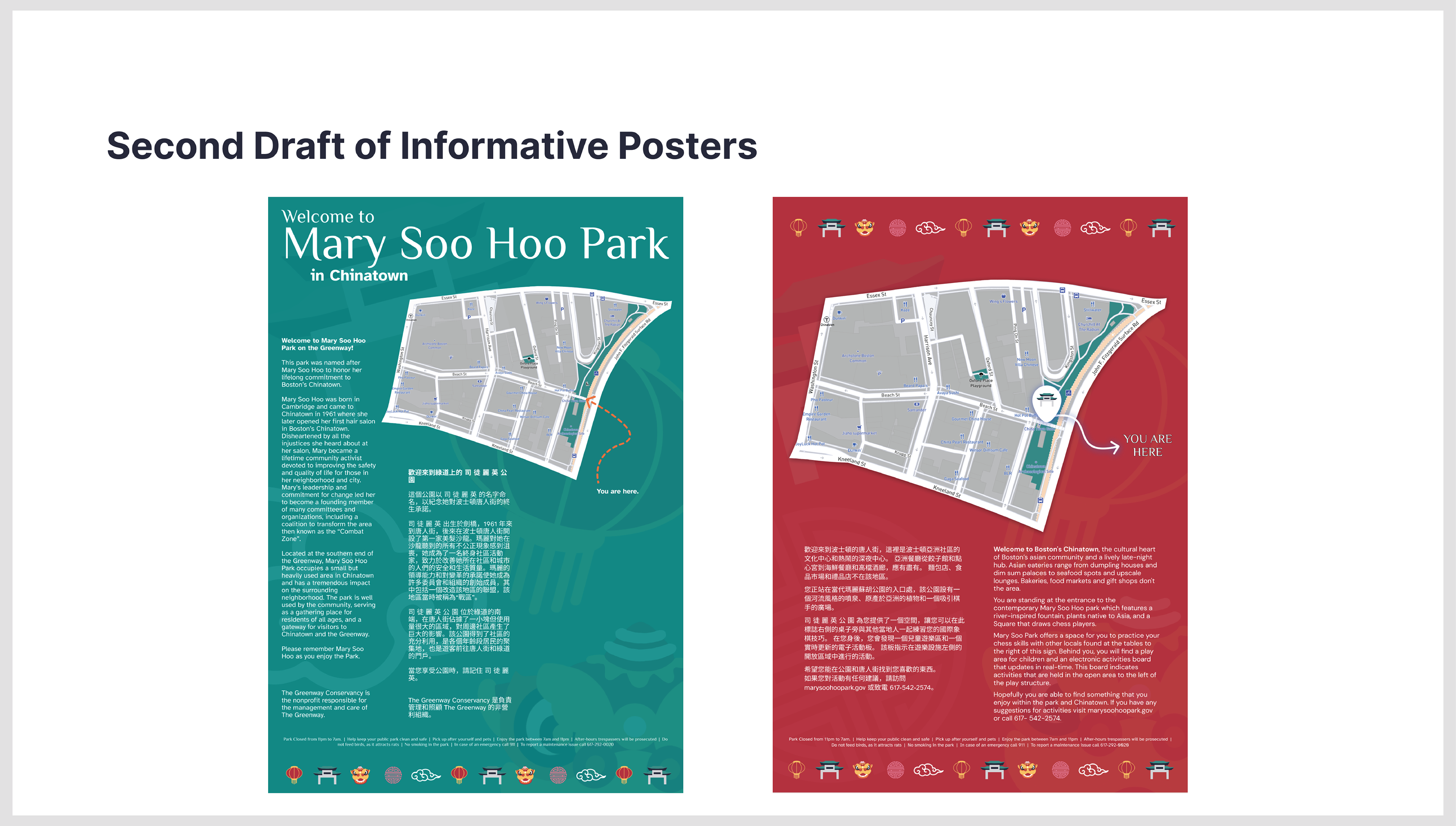
Mary Soo Hoo Park is a small but important piece of land for those in the Boston Chinatown area. The main demographic of the park is the elderly Chinese community. Some of the park goers will play chinese chess at the tables and the rest will stand around watching, for lack of seating. The chess tables are one small portion of the park while the rest is mostly an open concrete area. We were tasked with creating a better wayfinding and graphic experience for this park. A majority of this project was trial and error, creating a branding system or a mural and then realizing that it is not what the park or the patrons need. Another struggle was representing the culture of the main demographic without creating something stereotypical.
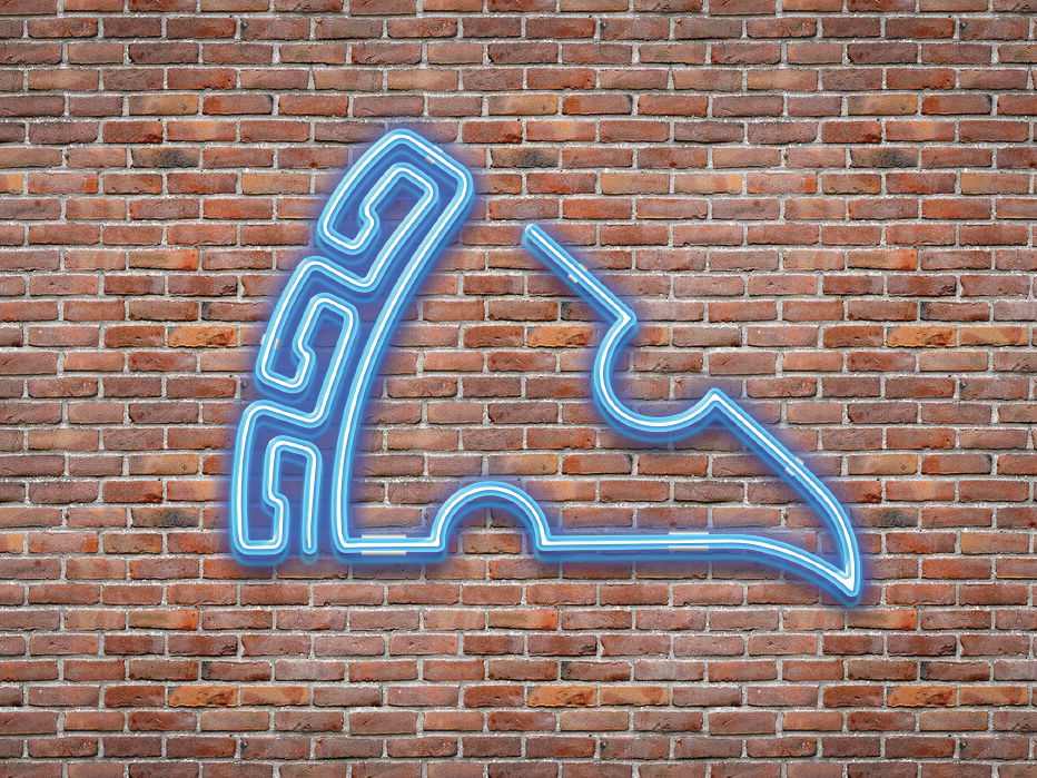
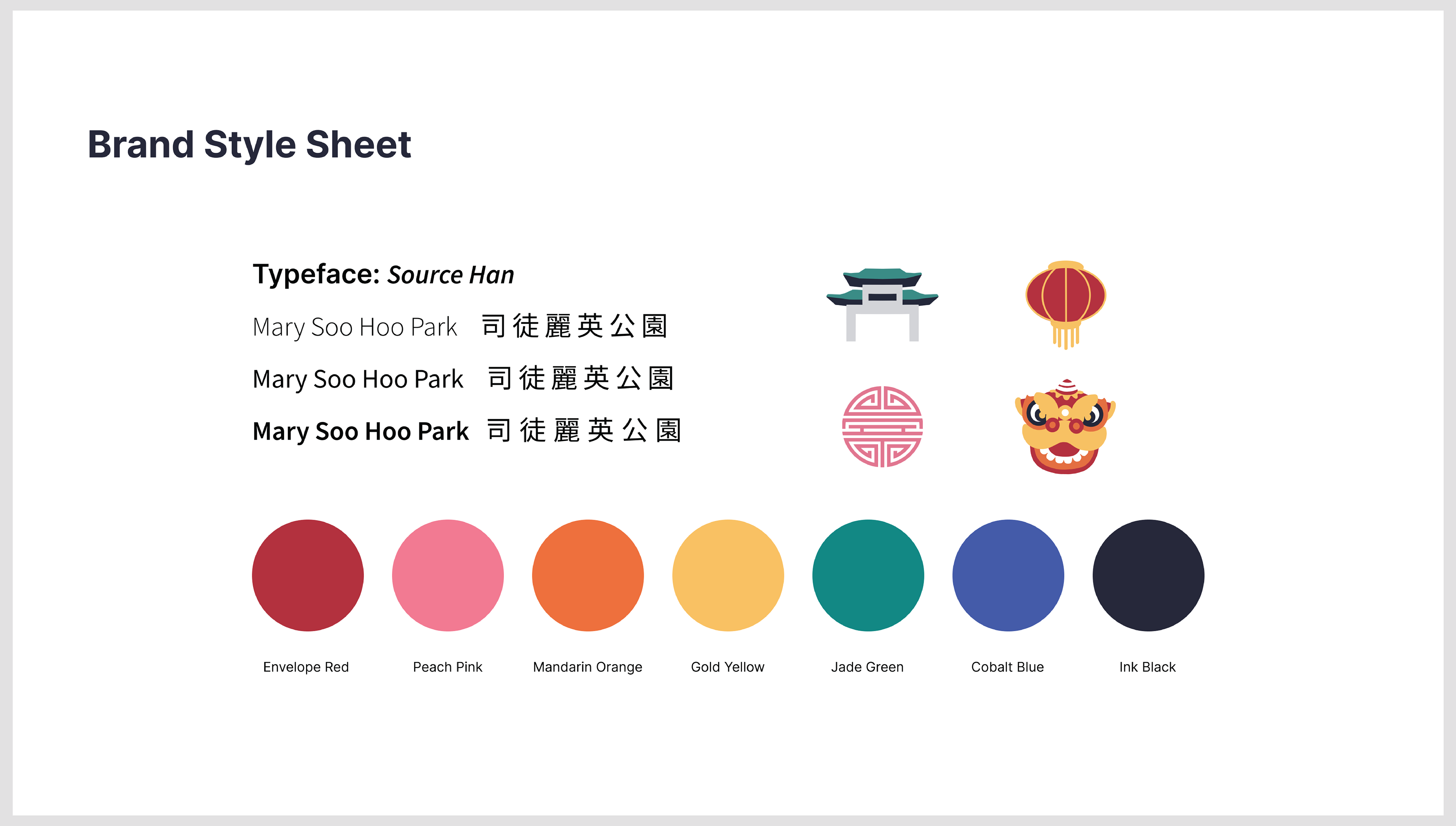
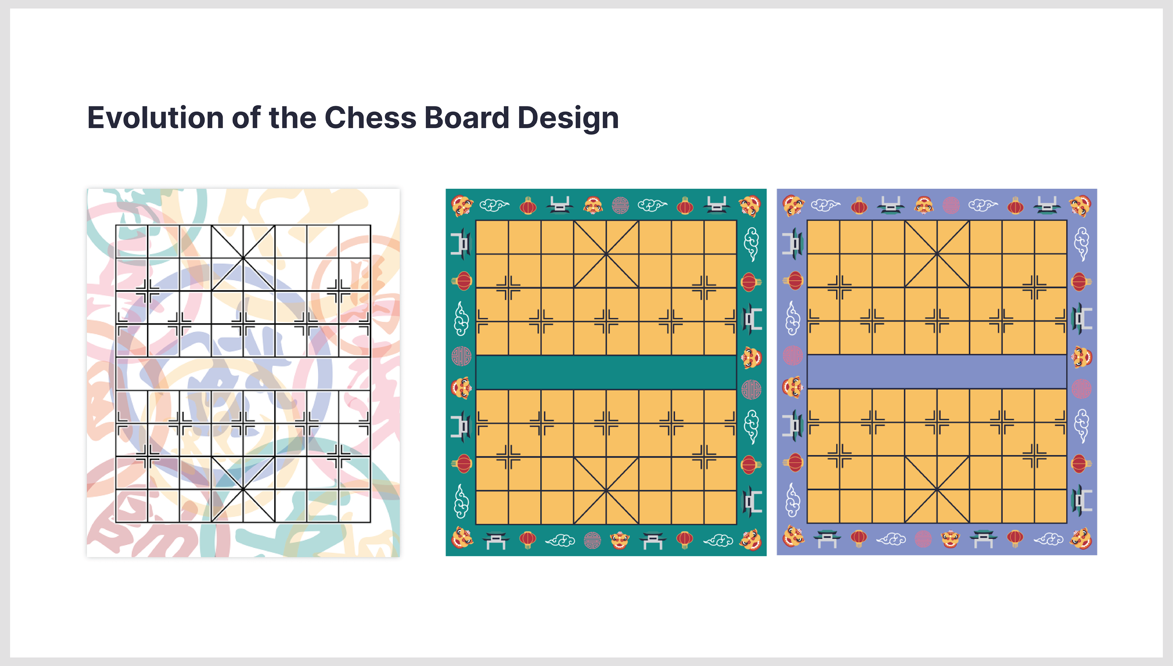
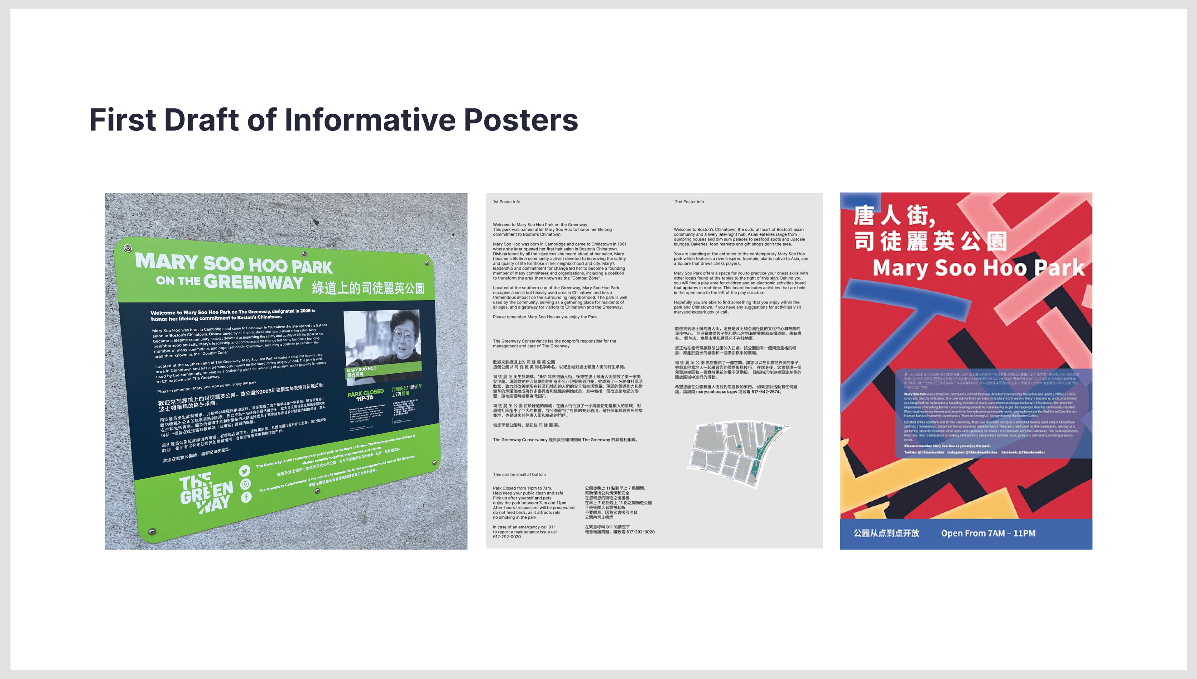
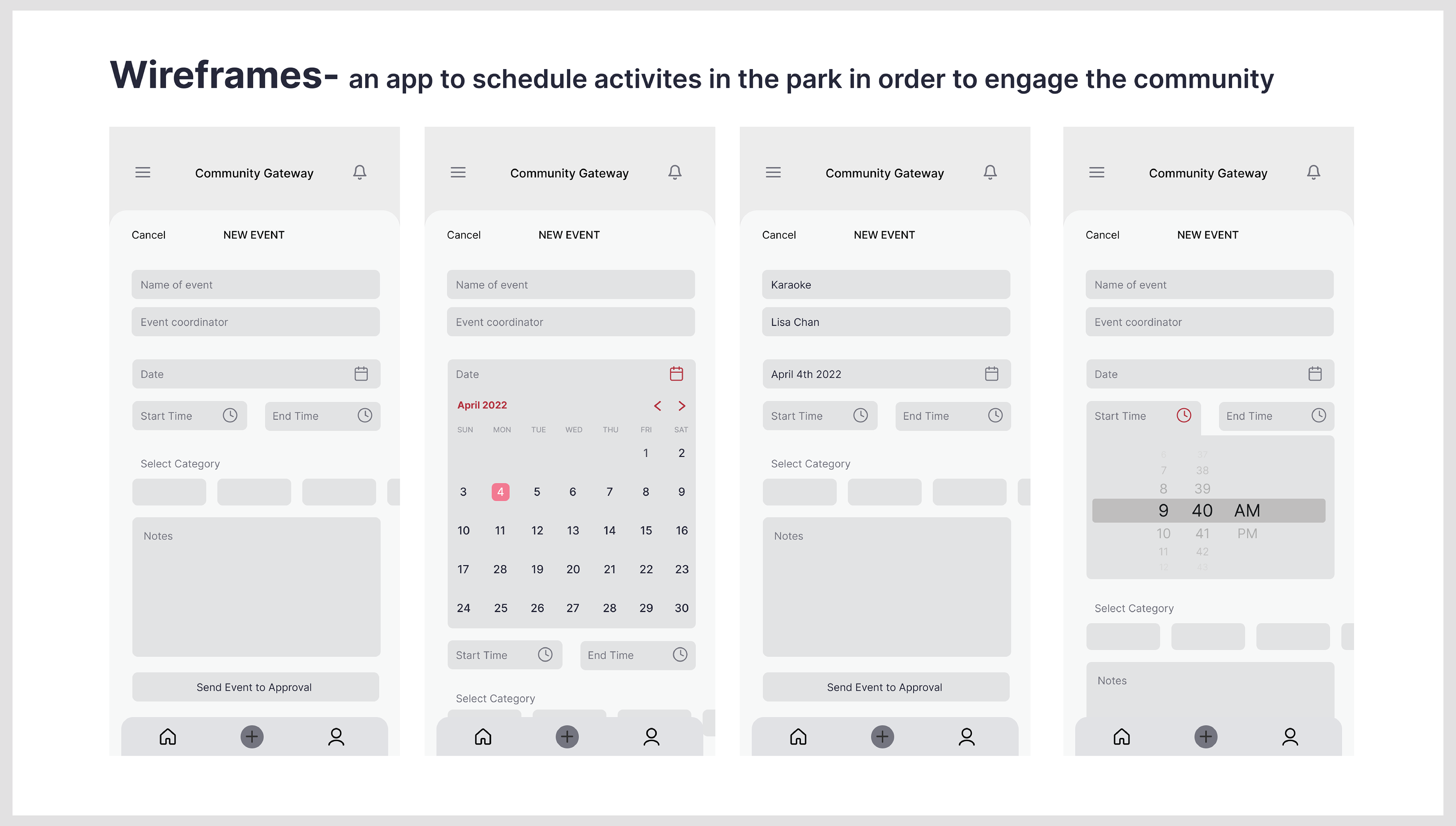
In the end we decided to base the design off of the grid system of the chinese checker board. Each section was a different color and the lines of the grid created a typeface for the logo we like to call Soo Hoo Sans. The misuse of space at the park we felt was the biggest issue, so using the six colors, we created a guide, each color would represent a different type of activity that could be hosted within the park, for example yellow would be exercise. We then split the park up into sections and created floor graphics of the chess board in different colors denoting the different activity sections. We then created a color coded multilingual poster template that people within the community could easily download and fill out to create and advertise different activity posters within the space. And lastly we created a website where activity leaders could register an event they wanted to lead within the park.
Research and Design Trial and Error
Final Design
